
The Joy & Pain of a Gallery Wall - How to create one with ease!
We’ve all seen them, loved them, tried them and then realised they’re not as easy to master as they look! Right?
It’s true, a gallery wall can help bring a scheme together, add interest to a blank wall, and eliminate that decision of which artwork to put on the wall (just put them all up)!
But this also causes some questions which need answering:

How do I ensure the images ‘go well together’?
What sizes should I use?
Same or different frames?
How do I arrange them?
How much will it cost?!
The cost factor is important when you’re a business, so I’ve added this one in especially for you SA/Holiday Let owners. The more artworks you need, the more you have to spend, but there are tips and tricks which consider this and which I’ll provide below.
So let’s get started …
5 basic steps to the perfect gallery wall!
How do I ensure the images ‘go well together’?

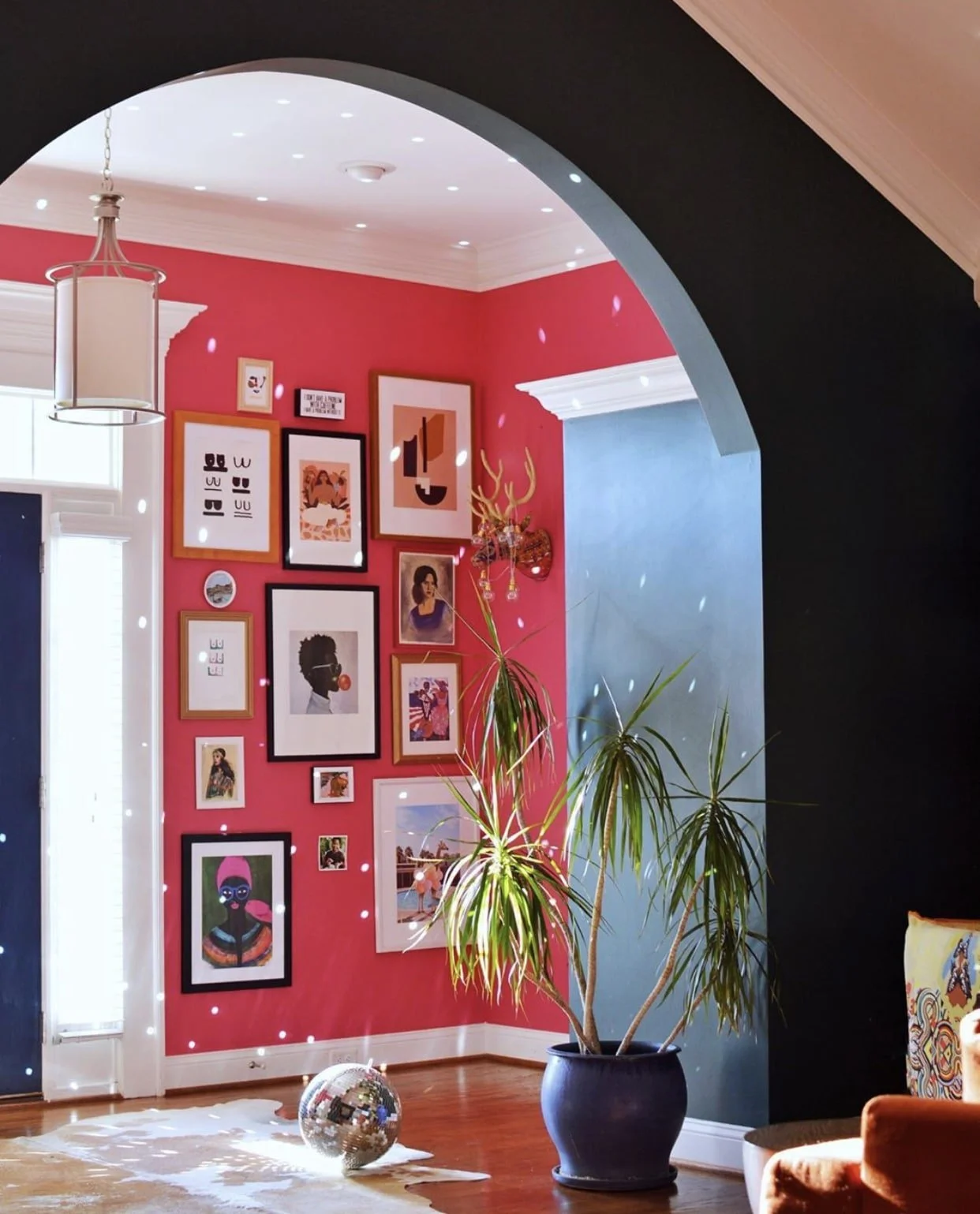
The beauty of a gallery wall is in the eclectic look - a combination of ‘collected’ items which simply just work because they each mean something to the people living there. BUT that doesn’t help if you’re an SA/holiday let owner does it?!
So in this case you have to embrace the variety! HOWEVER, I would say to have a common ‘theme’, which could be a featured colour or two, a common subject (e.g. most are landscapes, or most feature animals), or they could be linked by the shapes within the art (e.g. the all have curved lines). This commonality brings coherence and a feeling of grouping, rather than a jumbled combination of random items. Of course, if you want to attempt the jumbled look, then go for it - sometimes for no rhyme or reason, it just works! But if you’re unsure, I’d advise to stick to one of the common elements listed above.
2. What sizes should I use?
Again, variety is key here. It is good to have one large piece to centre everything around (see question 4 for layout!) and then a number of medium and small pieces.
Note that these do not all have to be rectangles/square - you could find artwork of different shapes (plates are great, or embroidery still in its hoop) or even items that don’t need framing, like wall hangings, textile pieces, sculptural art, or photos just pinned to the wall with a clip for a much more relaxed feel. You could even mount ‘found objects’ that represent the local area, or mirrors also work well.
Also, an extra tip is to mix up your horizontals and verticals - in artwork terms this would be ‘landscape’ and ‘portrait’ artworks and don’t always align them. Experiment also with pairs - identical shaped items alongside each other - this ‘order’ within the ‘chaos’ can be a nice resting place for our eyes!


3. Same or different frames?

This is completely up to you, as both can look great! If you go for the same-frame option however, I would say to mix up your artwork a bit more to ensure it doesn’t look too staged and ‘perfect’.
The mixed frames approach is more fun, and gives you many more options to play around with what works. I’d suggest starting with three different styles of frame, and add extra ones in as your confidence grows. For a modern clean look, go for simple white or black frames, with maybe a wooden option in the same style. You could bring some brass into the mix, and add a couple of more ornate frames in there too. Vary the width of the frames, and ensure you have pieces with border mounts in (you can have some artworks without the white borders, but in my opinion artwork often looks better mounted in this way).
4. How do I arrange them?

First of all, when thinking about the layout, I’d advise not putting any holes in the wall until you’ve done the following…
Lay your pieces out on the floor first, in the position you think you’d like them (ensure you have roughly the same size of floorspace as you have wallspace). This gives you a good idea of how they will look together.
As a general guideline, start with your largest piece, off centre (this makes the eye wanders round the artworks rather than being fixated on the central piece), then take your next biggest piece and position it further away from the large one - you don’t want all your large pieces together otherwise it will look off-balanced. Fill in the gaps with the rest of your artwork trying to ensure they don’t look too grid-like, but keep a balance throughout the whole space.
Leave between 5-10cm between each one, depending on how many you have.
Play around with the placement, standing back and looking from afar each time.
TAKE A PHOTO OF YOUR CHOSEN LAYOUT (Don’t miss this step or you’ll forget - been there done that!)
If you are being really clever, you can create paper versions of your artwork (same shape and size) and position these on the walls with blue-tac first - this is the ultimate in planning, but not really for the impatient! You can then also mark where you’ll need the nails on the paper, and put them directly through the paper, ripping it off when you’re done.
Layout of your gallery wall can make or break the overall look, so take your time over this step, if you can!
5. How much will it cost?!
This is, undeniably, an important consideration when you’re on a budget. But a gallery wall doesn’t have to be expensive. I would suggest spending the majority of your budget on a few (probably the larger) pieces, and supplement these with cheaper options. Here are a few ideas:
Visit a card shop. There are SO MANY amazing cards out there, at a fraction of the price of an artwork. Make use of them. Go to gallery shops as they’ll have a more ‘arty’ selection.
Use your own photos, especially of the local area. You don’t need to make them look professional, in fact, making them ‘authentic’ (a nice way to say ‘not that good’) adds a certain homeliness to your gallery wall, and also adds interest and curiosity. These could be displayed with a bulldog clip, or use washi tape on the corners for a more modern approach?
If you find any attractive leaflets/flyers/business cards from local attractions, frame them! This is also a great way to show what’s available for your guests in the local area.
Go to car boot sales / jumble sales / second hand shops. Bargains can be found! And sometimes they’ll be framed already. Keep in mind your common theme when browsing though or you may come home with more than you bargained for (no pun intended!)
If you have professional photos done for your property, add a few ‘incidental’ shots of both your property and the ‘view from the window’/local area. These are great for making the gallery wall more personal to your property.


Gallery walls are a great way to create a focal point or feature in a room, without going down the redecorating route.
They are great for that bland wall in your living area, or up the stairway/on the landing, or even behind a bed (although ensure they are well secured to the wall for obvious reasons!).
They are also great because you can change them fairly easily, or if one gets broken, you can easily fill it with something else - replacements don’t have to be identical.
Oh and one last thing, if you’re really hesitant to put lots of holes in the wall, you could put picture shelves up instead, and add your artworks to these. Make sure you have variety in heights though so they’re not all aligned.
Overall, have fun being the curator of your gallery! It adds personality to your property and shows your guests how amazing a gallery wall can look!
Tag me if you create a fab gallery wall and want to show it off! @bebraveinteriors
Photo Credits:
Photo by Jeff Mindell, from Studiodiy.com
Photo by David Fenton; home of Suna Lock. Featured on sunset.com
From Homepolish
Jessica Sample
Stacey-Ann Blake @designaddictmom
Photo by Zeke Ruelas Seen on Style By Emily Henderson by Ginny Macdonald
Photo submitted by Maia for Apartment Therapy
Photo by Fiona Murray, home of Kitty McCall featured in Design Sponge