Please the kids, and the parents will thank you! Interior design tips to wow ‘all’ of your guests
For anyone who has children, it’s a given that if your kids are happy while on holiday, then you will be too. When they are occupied, it leaves you time to relax and also enjoy your holiday. So with half-term coming up, and bookings hopefully flooding in for your holiday rental, how can you ensure that you please ALL your family guests? The answer is simple: Please the kids and the parents will thank you!
HOWEVER, as SA / holiday let owners you have a problem. Sometimes, your ‘kids’ room’ is booked for adults to stay in, and of course you wouldn’t want to dissuade those guests from choosing your property because of the Mickey Mouse themed room that you’ve designed for small children! So you have to find that balance between a room that appeals to kids, but which can also appeal to adults. But don’t worry, I’m here to help!
Here are 10 ideas you may want to take note of, which will give the kids something to get excited about, but which won’t eliminate groups of adults renting your property.
So remember, happy kids = happy parents = better reviews = better revenue! But don’t neglect the teenagers and adults who may be in the ‘twin room’ too - appeal to them AS WELL and that’s EVEN MORE REVENUE!
Colour has to be one of the easiest ways to transform a space, and colour is also a great way to attract kids to a space. But PLEASE don’t use garish colours that no one other than a bonkers 6-year-old would like!
Use bold colours, but keep it to just one main colour if on the walls, and use accessories to bring accent colours in. Go bold, is the biggest advice - you want something that stimulates a child’s mind; makes them excited to have that as their room; yet can also be a funky space for adults too.
Using colour cleverly, like in these examples, is the key.
There are some truly amazing wallpapers out there at the moment that can appeal to both kids and adults. Look for quirky wallpapers - animals (but not in a ‘nursery cartoon’ way) are great; as too are colourful florals, intricate patterns, or even graphic prints in large scale.
The examples here use quite subtle designs, but all would appeal to both young and old.
The accessories added in are also a key element to mix in with the wallpaper choice (see below).
Have fun choosing patterned wallpaper, be brave and don’t play it safe!
I love children’s books! The illustrations especially, and the front covers are often so beautiful that its a shame to hide them away in a traditional bookcase - so don’t! Have a narrow picture ledge shelf so you can display those books, cover facing out, for all to see - especially the kids! They will rush over to them and devour them (hopefully for hours!). Position the shelf quite low so it’s at their height, and you’re on to a winner for a bit of peace and quiet and an occupied child.
When your guests are adults, swap out the book display for less kiddie-books - again there are some amazing book covers that deserve to be seen. Choose books about the area, books inked to attractions close by, or just interesting reads covering a variety of topics - travel, craft, art, cycling, music, photography, beer-tasting! The list could go on! You don’t need many books to be able to do this as you can’t fit that many on these types of shelves!
Try it! Your guests (big or small) will love it.
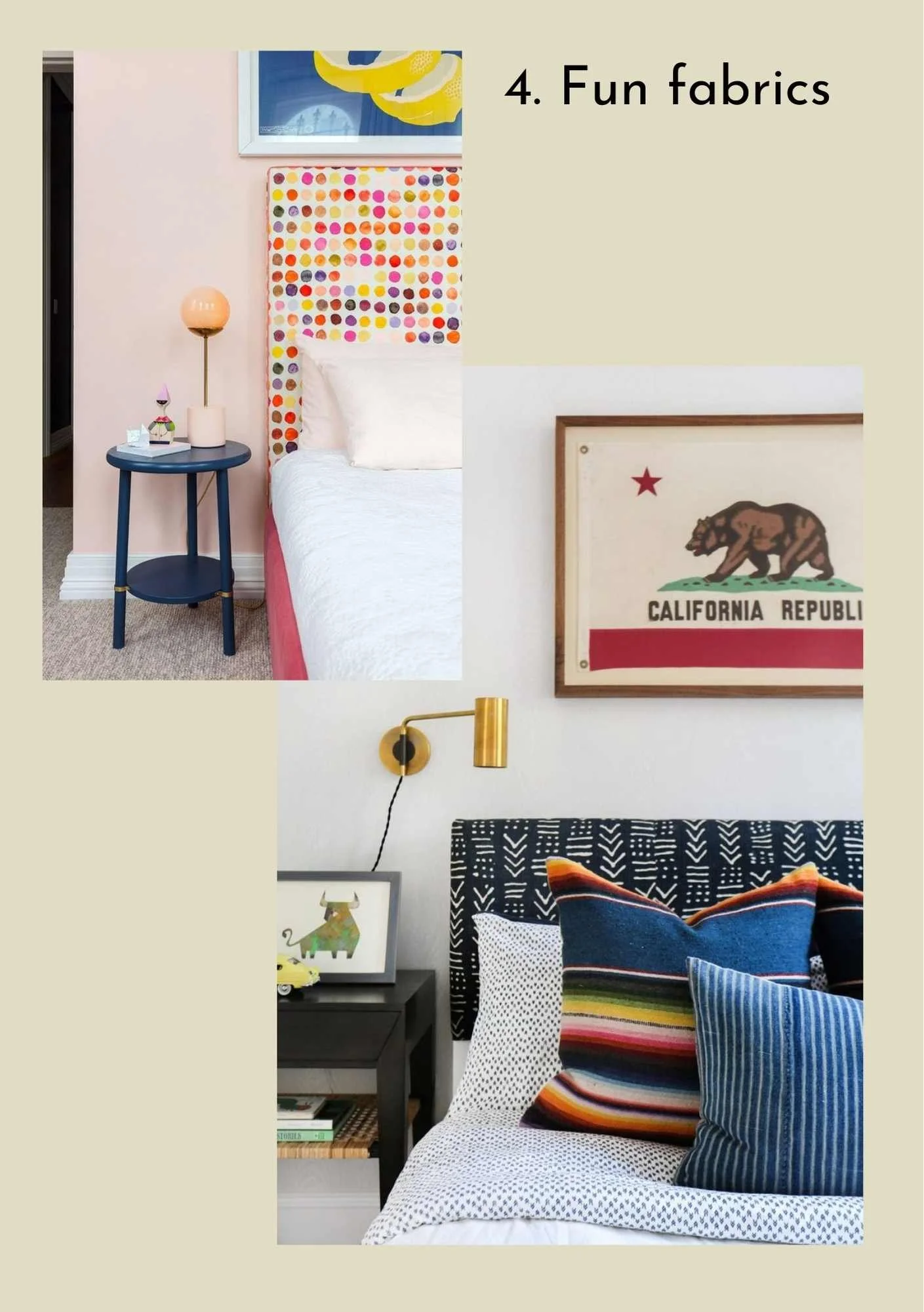
Use fabrics to add texture, and mix up the patterns. This gives a ‘fun’ element that the kids will love, but can also be attractive to adults too. I would definitely stay away from any ‘themed’ fabrics - use patterns and vary where you use them, so not only in your cushions and throws, but you could even recover a headboard as shown here, or frame some fabric!
Make the combinations of patterned fabric fun by bringing different colours in, or keep the colours the same but vary the style.
Don’t be afraid to use a bold fabric. It will make the room stand out in the best possible way.
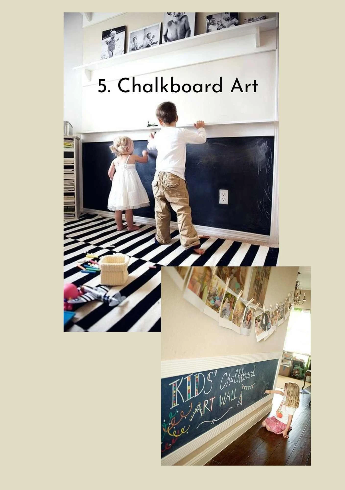
Ahh, we all love a good chalkboard don’t we?! And the kids ESPECIALLY will love it if its at their height! This will keep them entertained for hours - well worth it for pleasing the parents!
It only requires a quick clean up after each guest, and when there are no kids in the party, use it to write information on, like the wi-fi code, offers at the local shops, even the weather forecast!
This is a complete win-win, and a huge selling point for people to pick your property over any chalkboard-less competition!
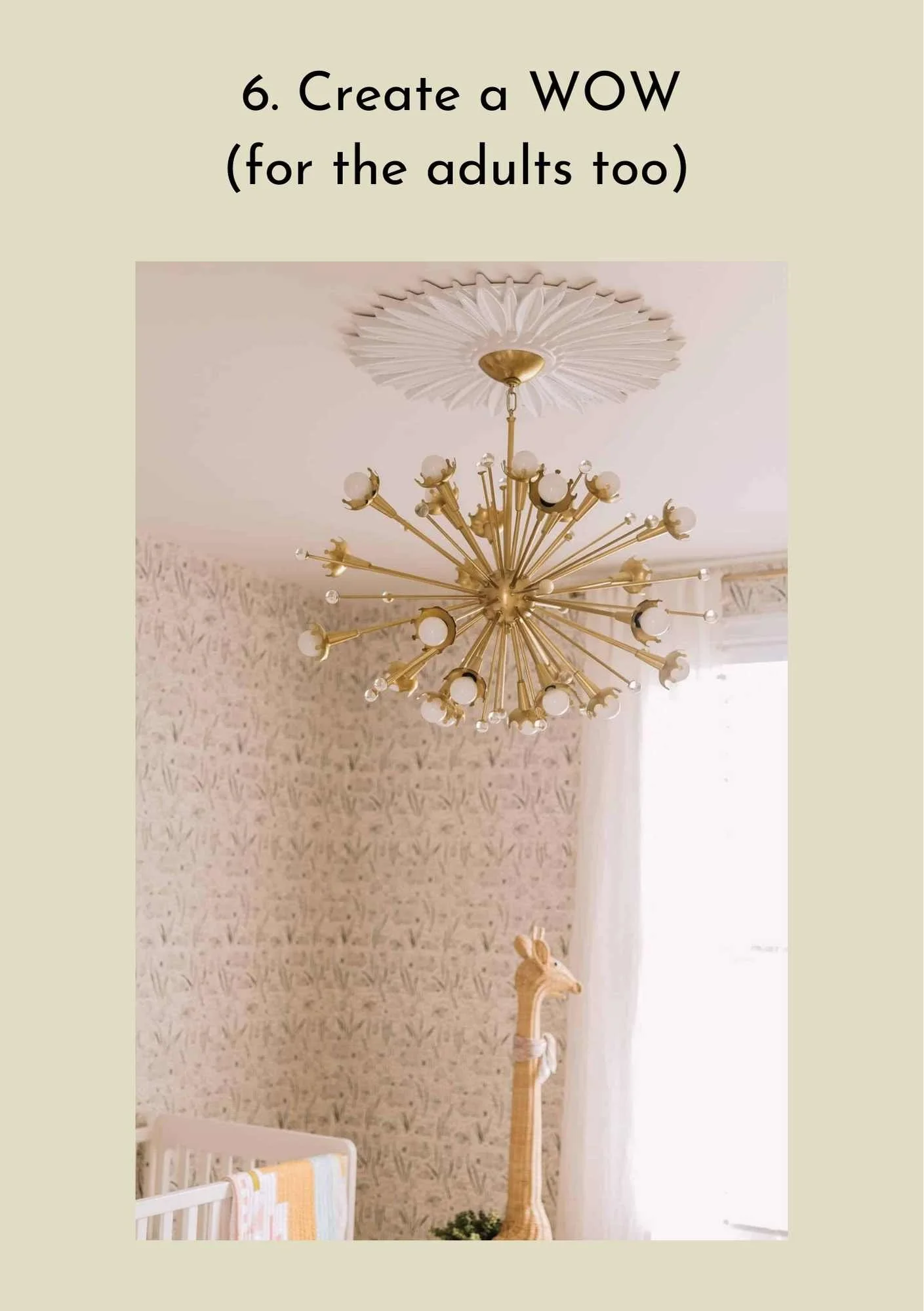
Creating a room that kids will love doesn’t mean that you can’t create the WOW factor that ALL your guests will love. Why not put that amazing light fitting in the kids room?
Imagine the kids faces when they see that THEIR room gives everyone the OMG reaction - how special will they feel?! And how great will the parents feel knowing that YOU have put effort into something for their children?
And it goes without saying that the adults who maybe drew the short straw by being given the usually ‘bog-standard twin room’, actually lucked-out and got the most impressive bedroom with the wow factor?!
Kids love art. It’s a given. So giving them paper and coloured pencils (or WASHABLE pens!) is a great idea, but why not go one step further and have a space for them to DISPLAY their art?! How pleased would they be if their art was in the ‘gallery’?
Encourage them to put their name and age on the drawing, and if they leave it behind, you can keep a selection of the drawings up for the next family who stays (obviously you’ll have to curate this gallery from time to time!). New guests see how much effort YOU have gone to in order to offer something special for the kids, and they will love you, and your property, for it!
If there are no children staying, you can remove all the kids artwork and replace them with info sheets on the local area, restaurant menus, local tourist attraction leaflets etc etc, which are usually kept. By using clipboards or a curtain pole & clips, this is a great display idea which is useful and attractive too.
Who doesn’t love a den?! Every kid I know does, and that includes a teenage den too!
If you can find a corner, a nook, or a small area in your property that could be useable space, then you are on to a winner. Add a range of books for all ages, a few floor cushions, may be some toys, paper & pencils etc, and the kids of any age will want to hang out there for sure! Parents will be happy, and you’ve not had to put any effort into changing the kids room as THIS is the space made especially for them!
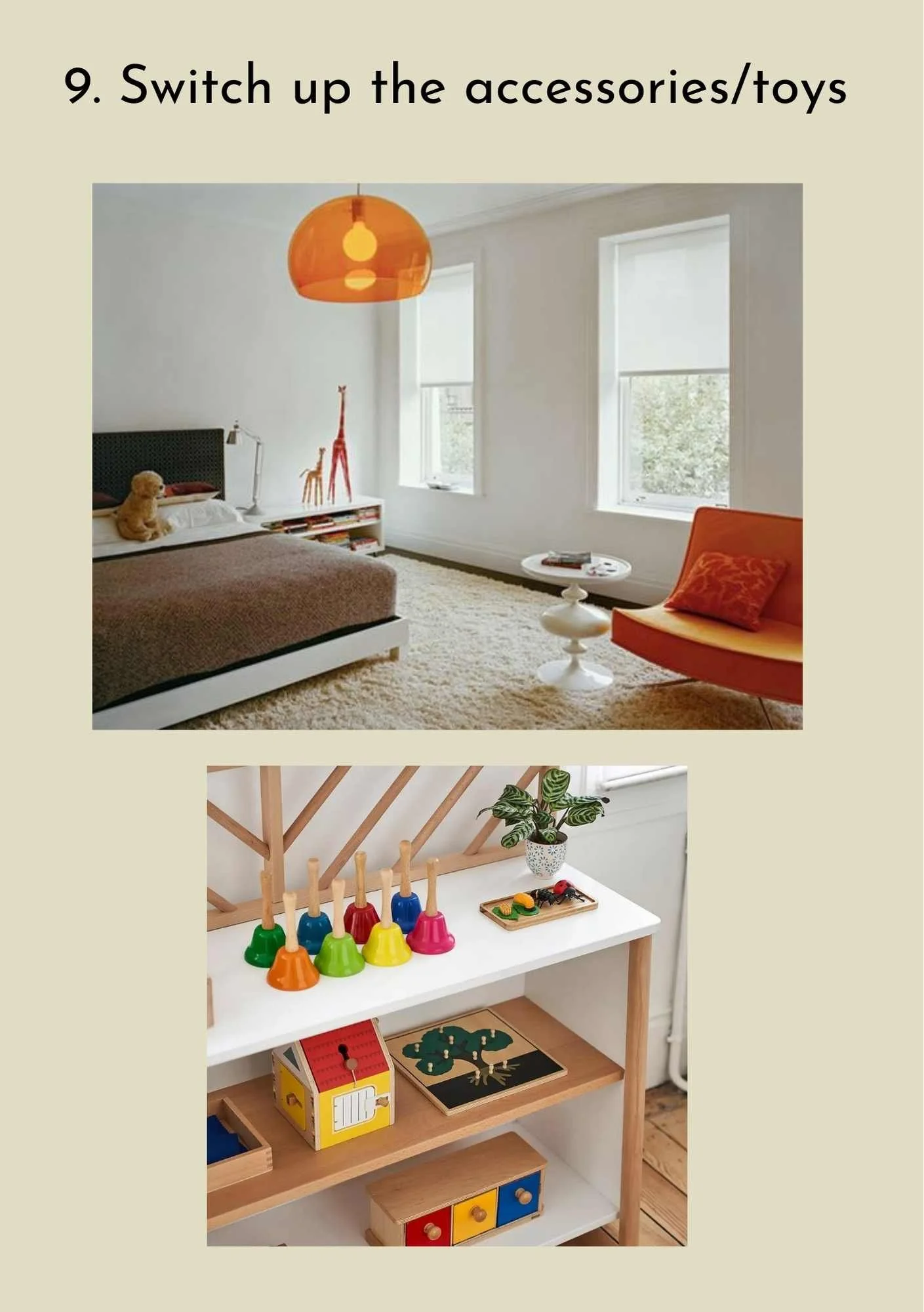
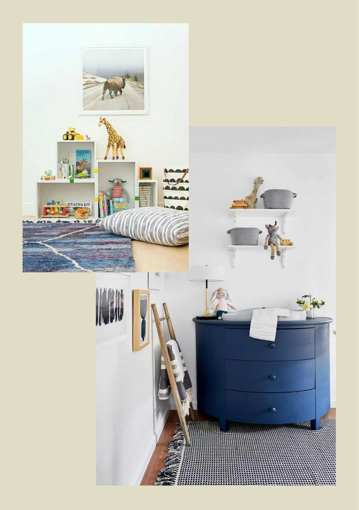
This is perhaps one of the easiest things to implement, although it does take a small bit of time on that all important change-over day, but it will be worth it for the impression it leaves with your guests. When booking, make sure to ask for the ages of the children, and have a small selection of age-appropriate toys in your property (these could ALL be kept in a toy trunk, and you bring the relevant ones out each time). Place the toys in the kids room - don’t just expect them to find them in the toy trunk. While I’m sure they will, by actually putting them in the kids room it shows effort on your part to cater for the children, and it will make the faces of the kids light up when they see their room, with toys for them to play with!
Soft toys will obviously need changing more frequently, so have more traditional wooden toys that will last longer. They can all be great ‘accessories’ to a room, as shown in this top photo - if you take the toys out it becomes a room for adults. Easy hey?!
You can also repurpose furniture if you know a child will be using the room, or like in the example below, make it into a changing station if the guests have a baby. Thinking outside the box in this way will give you so many more options to be able to cater to BOTH families and groups of adults equally well.
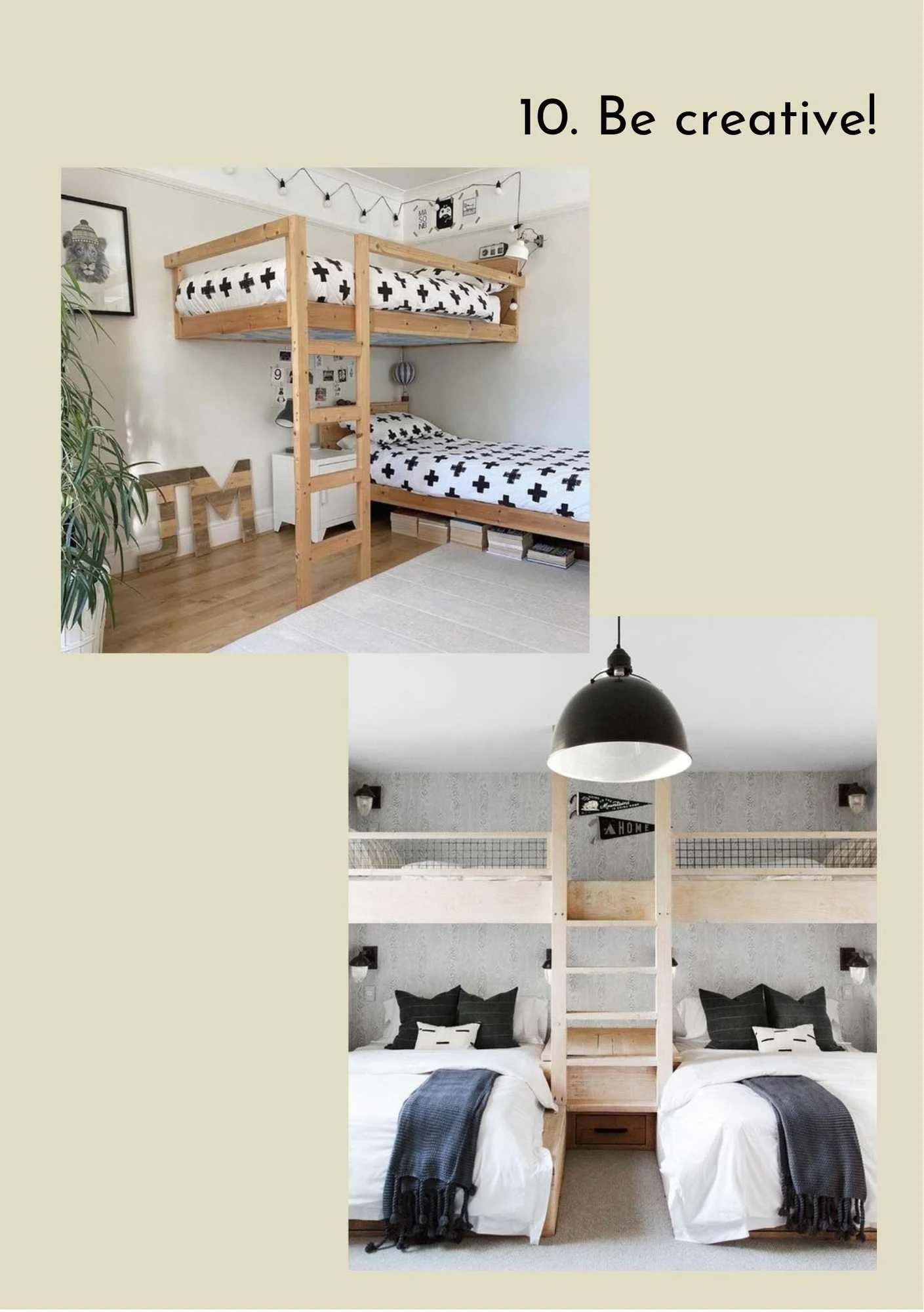
Finally, if you have to have bunk beds (which are generally used by children) then be creative and think about alternative ways to set the beds up.
Can you imagine the kids faces if you offered them something like these images? Anything out of the ordinary will excite the kids and make them love their holiday home even more. And if you have space for more than a bunk bed, take inspiration from this idea for a 4-bed room! Kids LOVE sleeping together, and this would take excitement levels through the roof!
Overall, think creatively and have fun with your interior design. Kids spaces allow for your imagination to run wild, but please also consider how it would feel for an adult staying in that space too. Make it funky, quirky and fun and you’ll be winning for both camps!
Credits:
Left: Trevor Tondro for The New York Times. Interiors: Laura Adams; Right: Photographer unknown. Design by Emily C. Butler.
Top left: https://i.pinimg.com/originals/90/8d/c0/908dc0064b050d195ba232b6c3729d36.jpg; Top right: Photographer unknown. Design by Studio DB; Bottom: A Beautiful Mess https://abeautifulmess.com/elsies-nursery-tour-and-baby-name/
Right: A Beautiful Mess https://abeautifulmess.com/elsies-nursery-tour-and-baby-name/; Left: Photo: Maree Homer Taken from: https://www.homestolove.com.au/how-to-keep-kids-organised-14345
Top: Photographer unknown. Design by Arent & Pyke; Bottom: Photographer unknown. Design by Amber Interiors.
Top: Image: f1rst.info on https://www.soumae.org/chalk-art-dicas-decoracao/; Bottom: https://www.bhg.com/rooms/rooms/entryway/6-ways-to-paint-a-boring-hallway-281474979506216/
A Beautiful Mess https://abeautifulmess.com/elsies-nursery-tour-and-baby-name/
Top right: Image credit: Natalie Jeffcott Taken from https://www.apartmenttherapy.com/madeleine-karls-colorful-and-creative-family-home-221187#gallery/49811/26 Top Left: https://www.atlantaparent.com/display-kids-artwork/; Bottom: Sean Knott www.seanknott.com. Design by me!
https://i.pinimg.com/originals/a9/eb/e6/a9ebe6edf6857cb37463ffe56ba2b910.jpg
Page 1 – Top: Architects - https://www.stevenharrisarchitects.com; Bottom: Montessori Toy Storage Unit on laredoute.co.uk; Page 2 – Top: Design by https://reganbakerdesign.com; Bottom: Design by https://stylebyemilyhenderson.com/blog/flash-makeover-reveal
Top: Sam Bramley https://www.instagram.com/sambramley.cc/; Bottom: Design by https://studio-mcgee.com


